
A mobile application for university students to find volunteer opportunities that match their schedules and needs efficiently.
Team Project - Won 1st Place over 40+ Teams in Course Competition
Jump to High-Fidelity PrototypesUser Research, UI/UX Design, Interaction Design, Visual Design, Wireframing, Prototyping
February 2022 - April 2022 (3 months), Revamped in November 2022
Anushka (me), Jonathan, Judy, Osman, Uzair


We used the double-diamond framework and the design thinking approach intertwined to progress from problem discovery to a potential solution.
.png)
In a brainstorming session, we all found volunteering to be a way to show gratitude to our communities: giving back time and skills. However, from personal experiences, we agreed that volunteering involves lengthy application processes and time commitment.
.png)
Initial research on existing solutions substantiated our assumption that there is currently no viable solution to the problem facing busy students who want to volunteer. Some issues we found with existing solutions:
Our own experiences and early research validated this problem space initially, but it would only be a user-centered design if we heard from users directly. We wanted to hear about their needs, motivations, passions, and pains in the context of volunteering.
.svg)
To form a comprehensive understanding, we conducted semi-structured interviews with seven student volunteers and surveyed 45 university students through a Google Forms questionnaire. Our thorough analysis of the resulting data revealed valuable insights that both confirmed and challenged our initial assumptions.
.svg)
Contrary to our assumption, an important insight was that students are willing to take on volunteering opportunities for short periods and varying lengths. This suggests that while students often have packed schedules, they may also want to commit to regular, long-term positions.
We also spoke to representatives from various volunteer organizations and learned that each uses different methods to advertise their positions to potential volunteers. We found a need for more short-term, one-off help, like at organization events. Most suggested they could find volunteers through posters, social media, and word-of-mouth. Still, they value a more reliable and efficient way to find volunteers with specific skill sets.
To immerse ourselves in the user's needs and problems and empathize with them, we created Jessica, a busy undergraduate student, and Matt, an outreach coordinator at a volunteering organization. We defined their goals, responsibilities, and frustrations using our research insights to ground our ideation in the explored user groups.
.png)


After listening to many busy people's experiences with finding volunteering positions, I mapped out the typical journey. Jessica's experience map below highlights essential stages and pinpoints moments of ease and frustration. From this, I gathered the main opportunities for our design.
.png)
We compiled some critical aspects that our design needs to include to be successful for the precise users we were considering.
.png)
Building off our initial problem and listening to numerous users’ experiences with finding and applying for volunteer positions gave rise to some viable, refined problem statements. For the scope of this project, we chose to concentrate on one:
.png)
We brainstormed many ideas for tackling busy individuals' struggles when looking for and applying for volunteer opportunities. Among all the crazy ideas, we came up with some more promising ones.

I expanded on three ideas, describing how they would work in the scope of the problem.


As a team, we considered each of these three designs in Jessica’s context, reflecting insights from the users in the interviews and survey. By evaluating the pros and cons of each related to the problem statements, design goals, and time constraints, we narrowed the concepts and solidified a vision for our solution.
.png)
We first drew two high-level storyboards to delve deeper into the user's experience using a swiping-based volunteer search and applying application. These depicted a volunteer and outreach coordinator's overarching journey with our design concept in their daily life. I also created three screen-level storyboards to map the various app stages users would go through to achieve their goals.
After pages of rough, low-fidelity sketches, we figured out the various mobile application screens, ways to lay out the screens, and what to include. We focused on constructing a cohesive and intuitive user flow during this process.
.png)
Using index cards and post-it notes to creatively assemble a paper prototype, we put together mobile application screens that best accomplished the user's needs. A low-fidelity prototype ensured we could test our first design iteration with users and make quick additions and improvements as we went.
%20(4).png)
While our prototype was rooted in user research throughout, we needed to gauge the user experience of our current designs. The objective of the evaluation methods was to determine the effectiveness of the present concept and ensure we were converging toward a solution that met
We employed a think-aloud study with six participants who used our paper prototype while narrating their thought processes. Additionally, we conducted a heuristic evaluation with six experts who evaluated the prototype against Nielsen's heuristics in various contexts. The resulting data from these studies provided valuable insights, which we analyzed by categorizing and identifying trends across all participants.
.svg)
The heuristic evaluation and think-aloud studies yielded multiple takeaways, influencing various design improvements to optimize the user flow and achieve the application's purpose. I incorporated these changes while constructing the digital mid-fidelity prototype, including simple yet vital design improvements to ensure a seamless and intuitive user experience, enabling efficient app usage:
There were some substantial changes that impacted the overall user flow or added an essential feature to enhance the user experience. The following are the major design additions and improvements.
.svg)
In addition to those screens, I digitized all the other paper prototype screens, including relevant screen and flow adjustments. I added interactions throughout the mid-fidelity prototype to emulate how a volunteer/organization rep would progress the app.
With a more refined design – one with a more polished user flow, overall screens, features, and more – we were ready to conduct a usability study to test users’ experience with the current design iteration.
.png)
We collected a large amount of feedback, formally measured with the SUS scale and informally through conversations with users, that informed improvements to the design when developing the high-fidelity prototype.


.png)
.png)
.png)
To ensure the look and feel of the application "matched" the ultimate user goals and needs, I created a system of design elements that emulated the vibrant, excited, yet professional experience of the mobile application.

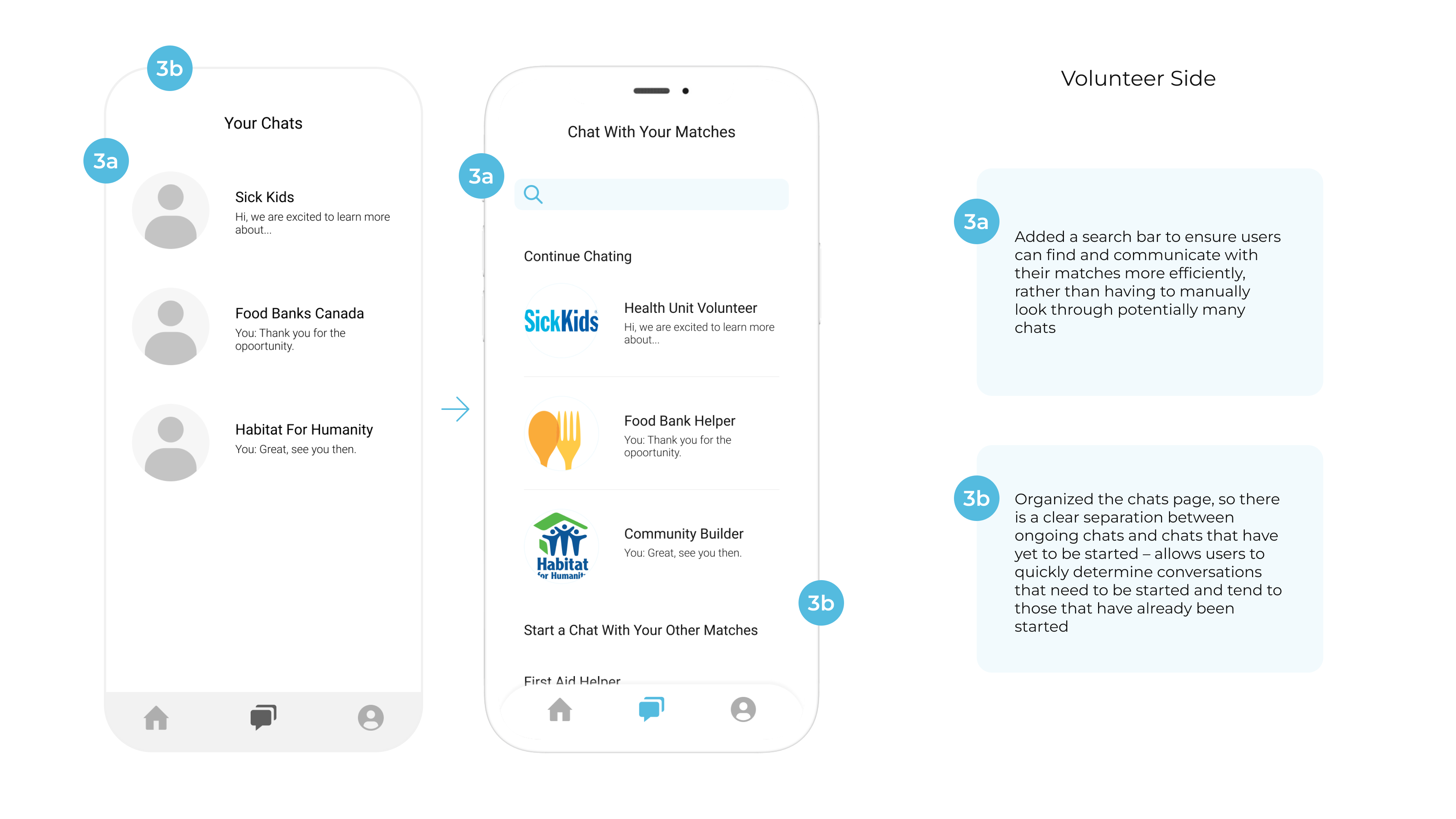
These are a few critical highlights of Volunteero on the volunteer user side:

Swipe-Based Volunteer-Organization Matching
The app's engaging swiping feature allows volunteers to quickly discover and apply for volunteer opportunities that align with their interests. When an organization accepts the volunteer's interest, the two parties match.
Detailed Volunteer Profile Setup
Users can personalize their volunteer experience by creating a profile highlighting their skills, time availability, interests, and certifications. This ensures that volunteers can find opportunities aligning with their goals and gain meaningful experiences.


Integrated Communication Platform
Matched volunteers and organizations can chat and call directly in-app, promoting seamless and efficient communication that eliminates the need to switch platforms. This enhances the volunteer experience by ensuring timely and clear exchanges that foster successful volunteer opportunities.
Additionally, to make the high-fidelity prototype come to life, I developed a vast collection of component variants to emulate the population of fields as users’ journey through the application.
Finally, after much research, ideation, and development, we developed a final set of prototypes: volunteer side and organization side.
Volunteero was an incredibly collaborative project altogether. We worked as a team to first understand a common problem experienced by students with busy schedules looking to show their gratitude to the community. We journeyed through the design process to design a potential solution grounded in user research. My main takeaways from this project:
A highlight: after three months of hard work, we presented our project to a panel of judges, competing with more than 35 other groups, and we won first place in the course competition - a validating moment! We gained much feedback, which we would love to implement if we had more time.

.png)
.png)
.svg)
.svg)


